
Using regression to learn how Bernie Sanders’s voter coalition changed between 2016 and 2020 in Texas
In this post I present a multiple regression analysis on county-level demographics from the US Census with the aim of understanding what types of voters drove the change in Bernie Sanders’s primary vote share between 2016 and 2020 in Texas.
I find that the demographics of Texas at the county level are too correlated to permit a detailed and quantified understanding of how individual demographics relate to the change in Sanders’s vote share using multiple regression.
By building only simple models, I find Sanders’s Texas coalition lost non-Hispanic White voters and gained Hispanic voters between 2016 and 2020, which is consistent with trends in national opinion polling and exit polling.
If you want to see the code I wrote to wrangle, analyze, and visualize the data, check out this pair of Python Jupyter Notebooks on my GitHub page.
Introduction
This project idea came to me one day while I was reading a FiveThirtyEight article assessing whether the 2020 Democratic primaries were having record-breaking turnout.
They weren’t.
In that article they mentioned performing a regression analysis on demographic data to understand the type of voter driving increases in voter turnout in the 15 states that had held primaries up to that point.
This got me thinking that the data must exist for me to do a similar regression analysis for my blog. This seemed like a great opportunity to further my understanding of regression modeling which I had encountered at a basic level many times in astronomy classrooms and to apply my skills in another domain that interests me—politics.
Sanders vote share decreased
Bernies Sanders was a surprising success in the 2016 Democratic primaries finishing second with 13,210,550 million votes and winning 23 states’ primary elections.
Stats from the Wikipedia article: Results of the 2016 Democratic Party presidential primaries.
In the 2020 primary, he had a marked drop in vote share in national polling due, in part, to the crowded field of candidates. In Texas, Sanders went from earning 33.2% of all votes in 2016 to 29.9% in 2020.
His raw votes went up from 476,547 to 626,339.
Exit polling by CNN showed Sanders’s vote share of individual demographics dropped in all categories except vote share of Hispanics. Most notably, Sanders’s vote share of Whites (presumably non-Hispanic) dropped from 41% to 29%, his vote share of Hispanics increased from 29% to 40%, and his vote share Blacks stayed at 15%.
CNN exiting polls of Texas in 2016 and 2020.
Using regression with demographics
Regression analysis is a powerful tool for understanding the relation between properties of a population. Regressing on demographics has been used to understand their relationship to election outcomes in a variety of ways including election forecasting, identifying irregularities in voting in the pivotal state of Florida in the 2000 presidential election, and understanding what type of voter drove increases in voter turnout in the 2020 Democratic primaries.
I debated with myself for a long time on the correct type of regression model to use for this analysis. While a negative binomial or Poisson regression analysis is appropriate because election data and most demographic data are fundamentally counting data, I have very little experience with these regression types. On the other hand, I’m very familiar with ordinary least squares (OLS) linear regression, which is the most popular so there’s tons of resources online, and it is the easiest to interpret. Plus, OLS can be used with counting data if they’re transformed to fractions or percentages of total, at the cost of introducing some correlation between related variables. Ultimately, I settled on using OLS because I knew that my analysis met at least some of the seven classical OLS assumptions and that the assumptions can assessed after a model was built by using diagnostics plots like residual plots. Put simply, as long as the observations of the error term in the linear model have constant variance and they are uncorrelated with each other and uncorrelated with the independent variables, then OLS can be used.
One of the perks of OLS is that it is easy to interpret. It allows you to understand quantitatively how the independent variables (in our case demographic variables) each relate to the dependent variable (e.g., the decrease in Sanders’s total vote share). The relationship comes straight from the model coefficients; a change of one unit in independent variable “A” leads to a change in the dependent variable equal to the coefficient of “A” with all other variables being held constant.
The data
To build a precise and interpretable model, independent variables must be chosen based on a strong theoretical understanding of the system under investigation. In place of a full literature review on how demographics relate to election outcomes, I adopted the demographic variables used by the election experts at FiveThirtyEight for their 2016 general and 2020 primary election forecast models. The demographic variables they use are related to race, education, income, an urban/rural measure (population density), religion, and liberal-conservative lean. Here is the list of variables I were able to collect that most closely match those used by FiveThirtyEight:
- White non-Hispanic
- White Hispanic
- Black
- Other race
- Fraction with a 4-yr degree
- Mean per capita income
- Population density
- Black Protestant
- Catholic
- Evangelical
- Jewish
- Mainline
- Mormon
- Other religion
- Unclaimed religion
- Margin of victory of Democratic candidates in 2008-2016 presidential elections (a proxy for county partisan lean)
The race, education, income, and population density variables were pulled from the U.S. Census Bureau. I used US Census data from the American Community Survey (ACS) 5-year estimates accessed via the easy-to-use and well-documented python packagecensusdata. The past Presidential election results were pulled from Data for Democracy’s data.world election transparency page. The 2016 and 2020 primary election results were gathered from the Texas Secretary of State website. The religious adherence data were pulled from the Association of Religious Data Archives, U.S. Religion Census, 2010. The Census and elections data are of high quality and have no missing data. The religious data are from 2010 (the latest available) and was collected via self reporting by congregations. Some congregations draw adherents from neighboring counties leading to some counties having more religious adherents than total population. Adherents outside of the 236 groups included in the study are combined with non-religious people in the “Unclaimed religion” category. I used data at the county level because counties are the smallest unit of comprehensive coverage shared by all of our data sources and the level at which the state of Texas collects and reports election results.
A comment on training/test split: Typically when building a model a test sample is left out to test the final model for over fitting. We did not leave out a test set because we wanted to train on as much of our small sample (254 counties) as possible, and we will not be using our model to make predictions. We assessed the over-fitting of our model with the predicted R^2 quantity which is similar to leave-one-out cross validation.
Building a model
Exploratory plots and observations
Figure 1 plots the difference in Bernie Sanders’s vote share percentage in 2016 and 2020, our dependent variable, against a number of covariates.
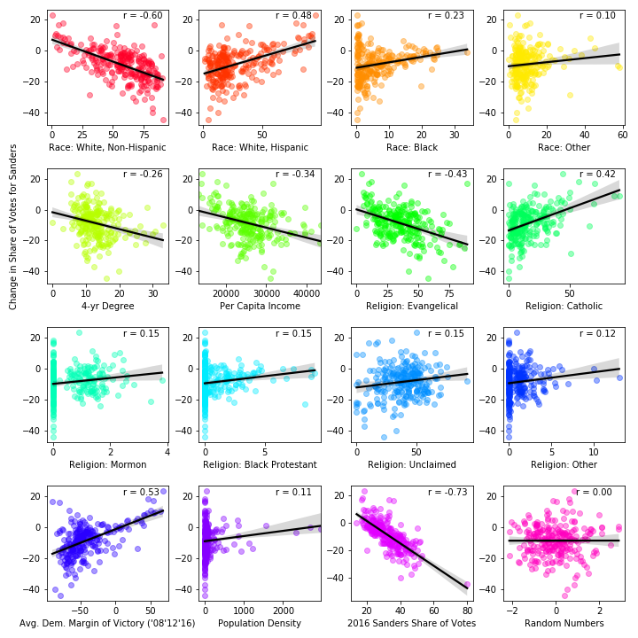
The plots show that the change in Sanders’s vote share is moderately anti-correlated with the percentage of White people; moderately correlated with the percentage of Hispanic people; weakly correlated with the percentage of Black people; and not obviously dependent on the percentage of people of other races; decreasing with the percentage of the population of a 4-year degree; decreasing with mean personal income; decreasing with the percentage of Evangelical adherents; increasing with the percentage of Catholic adherents; not obviously dependent on the percentage of Moron adherents, Black Protestant adherents, unclaimed adherents, and adherents of other religions; moderately correlated with the average margin of victory for the Democratic nominee in the past three presidential elections; and not obviously dependent on population density.
Out of curiosity, in the last two panels we plot the change in Sanders vote share versus Sanders’s vote share in 2016 and a list of (Gaussian-distributed) random numbers and see a strong anti-correlated in the former and (as expected) no apparent correlation in the latter.
The percentage of Mormon, Black Protestant and other religion adherents have values mostly below 5% with a large number of zeroes, which indicates these variables are unlikely to explain the change in Sanders’s vote share which are typically larger in magnitude (the mean magnitude change is 8.7%). In fact, the R^2 of a model built including these variables is only 0.009 greater than when they are excluded. Plots showing heterodasticity (e.g. Black, other race, Catholic, and population density) are transformed using the log function for the following anaylsis. A small percentage (<3.5%) of Black and Catholic values are zero and are assigned the value of 0.1 to permit computing the log.
Feature selection
With OLS regression, feature selection is an iterative process. The aim is to select the smallest subset of variables that explains nearly as much of the variance in the dependent variable as when including all of the independent variables. Goodness of fit metrics like R^2 and Adjusted R^2 are often used as estimates of the variance explained by the model with their own advantages and disadvantages.
Another aim to feature selection when building a model for interpretation (instead of prediction) is to include features that have statistically significant model coefficients, which requires P-values that are smaller than a prescribed threshold (often 0.05).
To understand the maximum variance explained by our dataset, I started by building a model with all remaining independent variables. (I excluded percent_hispanic because it is strongly correlation with percent_white because strongly correlated independent variables break a fundament assumption of OLS.) By doing so I can get a rough idea of the most significant features based on coefficient size (and can compare them to the features with the strongest correlations in the correlation plots above). I used the OLS command from the python package statsmodel for fitting which gave the following results:
                              OLS Regression Results
==================================================================================
Dep. Variable:      delta_percent_sanders   R-squared:                       0.465
Model:                                OLS   Adj. R-squared:                  0.442
Method:                     Least Squares   F-statistic:                     21.08
Date:                    Tue, 25 Aug 2020   Prob (F-statistic):           5.25e-28
Time:                            10:31:07   Log-Likelihood:                -870.23
No. Observations:                     254   AIC:                             1762.
Df Residuals:                         243   BIC:                             1801.
Df Model:                              10
Covariance Type:                nonrobust
===============================================================================================
                                  coef    std err          t      P>|t|      [0.025      0.975]
-----------------------------------------------------------------------------------------------
const                          14.1786      5.792      2.448      0.015       2.769      25.588
percent_white_nh               -0.2670      0.049     -5.480      0.000      -0.363      -0.171
percent_w4yrdeg                -0.4486      0.164     -2.738      0.007      -0.771      -0.126
per_capita_income            6.833e-05      0.000      0.436      0.663      -0.000       0.000
percent_evangelical            -0.0754      0.065     -1.165      0.245      -0.203       0.052
percent_unclaimed_religion      0.0066      0.058      0.115      0.909      -0.107       0.120
margin_of_victory_D_avg         0.0066      0.031      0.215      0.830      -0.054       0.067
log_percent_black               0.7573      0.442      1.715      0.088      -0.112       1.627
log_population_density          0.9993      0.441      2.267      0.024       0.131       1.868
log_percent_catholic           -0.2365      0.642     -0.368      0.713      -1.501       1.028
log_percent_other_race         -2.2300      0.800     -2.786      0.006      -3.807      -0.653
==============================================================================
Omnibus:                       35.883   Durbin-Watson:                   2.218
Prob(Omnibus):                  0.000   Jarque-Bera (JB):              109.422
Skew:                           0.571   Prob(JB):                     1.73e-24
Kurtosis:                       6.006   Cond. No.                     3.17e+05
==============================================================================

Warnings:
[1] Standard Errors assume that the covariance matrix of the errors is correctly specified.
[2] The condition number is large, 3.17e+05. This might indicate that there are
strong multicollinearity or other numerical problems.
The goodness-of-fit statistic is decent (r^2=0.465) and can be interpreted as the model explaining about 50% of the variance in the data. Many variable coefficients are insignificant, so not every variable is relevant to the change in Sanders vote share. Next I looked at a goodness-of-fit statistic for over-fitting (the predicted r^2) and the VIF statistic for multicollinearity (or correlation between independent variables):
Predicted R^2:  0.38

   VIF Factor                     features
0   36.121012             percent_white_nh
1   21.870679              percent_w4yrdeg
2   64.362556            per_capita_income
3   11.349248          percent_evangelical
4   10.458186   percent_unclaimed_religion
5    9.849860      margin_of_victory_D_avg
6    2.892990            log_percent_black
7   10.647302        log_population_density
8    6.394612         log_percent_catholic
9   12.464885       log_percent_other_race
The predicted r^2 value of 0.38 indicates a slight over-fitting problem.
The smaller the predicted r^2 as compared to the regular r^2, the greater the problem of over-fitting.
All but one variable has a VIF value over 5 which indicate significant multicollinearity. This is a problem that I explore.
The problem of multicollinearity
The multicollinearity is a big problem for us with our goal of interpreting the coefficients of our model. Let’s visualize this multicollinearity another way to understand it better. Figure 2 is a correlation heat map of the variables in this model (plus Hispanic percentage) made with the seaborn.heatmap command:
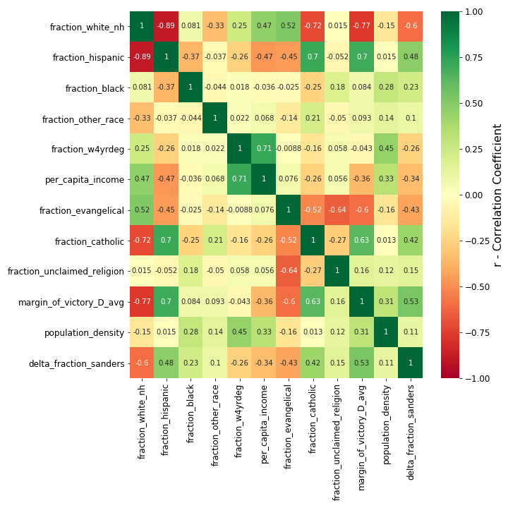
Our multicollinearity problem is almost completely illustrated in the top two rows of the heat map. The top row shows that the percentage of non-Hispanic Whites is at least moderately correlated with six other demographic features and the dependent variable (the change in Sanders vote share). Because the percentage of non-Hispanic Whites strongly anti-correlates with the percentage of Hispanics, the percentage of Hispanics also correlates with the six same demographic features. This means that the independent variables will change in unison and are not independent, which makes it difficult for the model to measure the effect on the dependent variable from each of the independent variables, holding the others constant. This results in less precise coefficient estimates and weaker statical power of the model.
It’s worth noting that only the correlation between variables of the same type (e.g., race, religion) could be attributed to the use of precentages instead of raw counts. The correlations between variables of difference types would still be present if we regressed on counts instead.
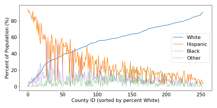
So what is happening here? Basically, most Texas counties are bifurcated along most demographics. For example, along race and ethnicity we see that most counties are comprised of mostly White and Hispanic people such that in counties with a large percentage of Whites, there is a low percentage of Hispanics, and in counties with a large percentage of Hispanics, there is a low percentage of Whites. This can be seen in Figure 3 which also includes the percentage of Black people and people who identify as another race:
With religion, not only are evangelicals and catholics often the largest or second largest religious groups in a typical Texas counties, but in Texas evangelical are predominately White and Catholics are predominately Hispanic. Regarding partisan lean in Texas counties, Hispanics overwhelming support Democratic candidates in presidential elections while Whites overwhelming vote republican. Weaker—but still significant—bifurcation exists in Texas counties due to economic and educational measures due to inequality, which also correlate with race.
This bifurcation of Texas creates a dearth of counties in parts of the demographic parameter space preventing the regression model to control for individual variables with precision. Instead the model essentially works with a sparse and redundant data set, weakening the statistical power of the model and weakening the significance of coefficients. With weakened significance of coefficients, we lose our ability to determine which variables are meaningful and to measure their effect on the change in Sander’s vote share.
There are a few ways to deal with multicollinearity. We could remove highly correlated variables (like we have already done with percentage_hispanic), we can combine dependent variables (although I don’t think this makes sense given our variables), or we can perform an analysis designed for highly correlated variables like Lasso regression or MANOVA (which would deserve its own blog post).
Ideas from the Statistics by Jim article Multicollinearity in Regression Analysis: Problems, Detection, and Solutions.
For the sake of presenting a final model and interpretation, I explore the first option.
A simple interpretable model
Requiring the final model to include only statistically significant variables with VIFs below five, produced only a handful of simple models with at most three variables. Of these models, the one with the largest R^2 values included only race-related variables: the percentage of the population that is non-Hispanic White, Black, and “other race”, respectively. The regression results for this model were as follows:
                              OLS Regression Results
==================================================================================
Dep. Variable:      delta_percent_sanders   R-squared:                       0.419
Model:                                OLS   Adj. R-squared:                  0.412
Method:                     Least Squares   F-statistic:                     60.04
Date:                    Tue, 25 Aug 2020   Prob (F-statistic):           2.88e-29
Time:                            11:06:30   Log-Likelihood:                -880.64
No. Observations:                     254   AIC:                             1769.
Df Residuals:                         250   BIC:                             1783.
Df Model:                               3
Covariance Type:                nonrobust
===========================================================================================
                              coef    std err          t      P>|t|      [0.025      0.975]
-------------------------------------------------------------------------------------------
const                      14.1797      2.402      5.904      0.000       9.449      18.910
percent_white_nh           -0.3323      0.025    -13.254      0.000      -0.382      -0.283
log_percent_black           1.5020      0.339      4.426      0.000       0.834       2.170
log_percent_other_race     -2.8785      0.756     -3.808      0.000      -4.367      -1.390
==============================================================================
Omnibus:                       14.125   Durbin-Watson:                   2.295
Prob(Omnibus):                  0.001   Jarque-Bera (JB):               36.206
Skew:                           0.066   Prob(JB):                     1.37e-08
Kurtosis:                       4.845   Cond. No.                         304.
==============================================================================

Warnings:
[1] Standard Errors assume that the covariance matrix of the errors is correctly specified.

Predicted R^2:  0.39

   VIF Factor                 features
0    3.637555         percent_white_nh
1    1.613324        log_percent_black
2    3.742407   log_percent_other_race
As expected, using fewer variables decreases the R^2. This model accounts for about 42% of the variance in the change in Sanders’s vote share. The over-fitting is minimal as the predicted R^2 (0.39) is not much less than the R^2 (0.42). Because this model only includes race-related demographics the interpretation is very simplistic.
The constant coefficient is ~14, which means an increase in Sanders’s vote share of 14% between 2016 and 2020 is expected when a Texas county has zeros in the other race variables, or conversely, a Hispanic percentage of 100%. The percent_white_nh coefficient of -0.33 means that for every percentage the White percentage increases, the change in Sanders’s voter share decreases by 0.33 percentage points. The log of the Black percentage and Other race percentage have coefficients of 1.5 and -2.9, respectively. For these log transformed variables, the change in Sanders’s vote share will increase (decrease) by 1.5 (2.9) percentage points every time the Black percentage (Other race percentage) increases by a factor of ~2.72
the value of e
, which is a rather insensitive relationships. The confidence intervals on all of the coefficients are fairly large, but they do not effect the general interpretation.
Simply put, the more non-Hispanic White a county is, the greater the loss of vote share for Sanders in 2020. Because the percentage of non-Hispanic Whites and Hispanics in the population are so strongly anti-correlated in Texas counties, Sanders vote share increased when this trend is extended to predominately Hispanic counties. This can be seen directly in the frist two panels of the correlation plots in Figure 1.
Limitations
One limitation of this study is that while the demographic data is descriptive of the entire population in each county, the dependent variable is derived from Democratic primary voters, a very non-representative sample of the overall population. Another limitation is the large range in the number votes cast in each county suggests that not every county should be given the same weight and a weighted regression may be more appropriate. Finally, it appears that demographics that are useful for reproducing national election results at the state-level (i.e., the demographics we adopted from FiveThirtyEight’s election forecasts) are not useful for building interpetable models at the county level in Texas.
Conclusions
In this post I used multiple regression analysis on county-level demographical data to understand what types of voters drove the change in Bernie Sanders’s primary vote share between 2016 and 2020 in Texas.
I found that the demographics of Texas at the county level are too correlated to permit building a model with more than three statistically significant demographic variables and thus prohibits a detailed understanding of how individual demographics relate to the change in Sanders’s vote share.
More specifically, Texas counties are predominately White, non-Hispanic or predominately Hispanic and both of these groups appear to be homogenous across the state in terms of the other demographic and socioeconomic variables considered.
One of the few statistically significant models permitted by the dataset shows that Sanders’s Texas coalition shrunk by 0.33 percentage points for every percentage point increase in the White population. In other words, the more non-Hispanic White a county is, the greater the loss of vote share for Sanders in 2020, which is consistent exit polling.